Social media is easily one of the fastest ways to connect with your audience or customers, but snagging people’s attention (and keeping them engaged) isn’t always as straightforward as posting a nice photo or a clever caption. Time after time, I see businesses and creators struggle with social media design mistakes that turn people away before they even get to read the message. If you’re hoping to boost your social media engagement, catching these design mistakes early can make a huge difference. Here, I’m breaking down the most common mistakes and giving you practical tips for turning things around.
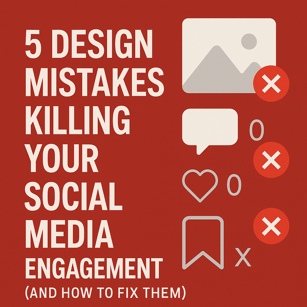
Common Design Mistakes Killing Your Social Media Engagement
If you’re pouring hours into content but not seeing much response, your design could be working against you. Poor designs can feel overwhelming, look unprofessional, or just fail to stand out in crowded feeds. Over time I’ve learned that sometimes it’s not what you say, but how you show it. Here are some of the most frequent mistakes I spot:
- Overcrowding the Image: Trying to fit too much into one graphic just confuses viewers.
- Inconsistent Branding: Using different colors, fonts, or styles makes your feed look messy and hard to recognize.
- Illegible Text: Fancy fonts or low contrast can make your message impossible to read, especially on mobile.
- Ignoring Platform Guidelines: Wrong image sizes or ignoring how content is cropped means key info is cut off or blurry.
- No Visual Hierarchy: When every element shouts for attention, nothing gets noticed.
It’s super important to avoid these, since even the best offer or the smartest tip can get missed if the design puts people off. Not only do these mistakes look awkward, but they also signal a lack of attention to detail. Over time, these seemingly small errors may add up and hurt your brand’s overall reputation. This means people are less likely to trust your posts or want to check out your profile further.
Why Good Design Matters for Engagement
People scroll through hundreds of posts a day, so first impressions have to be strong and immediate. Good design quickly tells your audience what your brand is about, helps them recognize you in a crowded feed, and makes your key message clear. I’ve found that posts with sharper visuals, clear branding, and room to “breathe” almost always get more likes, comments, and shares.
Inconsistent or poor design, on the other hand, doesn’t just hurt your visual appeal. It can actually make your business look less trustworthy. Research by HubSpot shows that brands with consistent visual identity see higher engagement and loyalty. People want to feel confident they’re dealing with a real, reliable business. That strong first impression from good design can encourage users to keep scrolling through your posts or even follow and engage further.
A sharp design not only attracts viewers, but it also helps guide their eyes to the message you want to communicate most. When the right elements pop and nothing gets lost in a cluttered graphic, your audience can quickly pick up on your call to action. This makes it more likely they’ll interact with your post or share it with others.
Quick Wins: How to Spot and Fix Design Mistakes Fast
- Step Back and Review Your Feed: Open your Instagram grid or Facebook page and scan as if you haven’t seen your posts before. Notice what jumps out, whether it works well or needs improvement.
- Ask for Honest Feedback: Sometimes we’re too close to our own work. Ask coworkers, friends, or followers for their thoughts on what looks confusing or messy.
- Compare with Top Brands: Find accounts you admire in your niche. What do they do differently? Make some notes and see how their graphics stand out without overcrowding or mismatched branding.
How to Fix It
- Less is More: Don’t try to cram too much info into one graphic. Focus each post on one idea only.
- Stick to a Brand Style Guide: Create a simple color palette and pick two or three fonts. Use them everywhere to make your posts recognizable.
- Make Text Readable: Always check your font size and contrast, and preview how designs look on a mobile phone. Readability is more important than a fancy font every time.
- Resize for Each Platform: Use tools like Canva or Adobe Express to create templates sized for each channel so your images always look crisp and professional.
- Use Visual Hierarchy: Make your key message the largest or boldest element, and let less important details fade into the background so viewers know what to focus on first.
Don’t forget to review older posts and update your approach as you learn what resonates more with your audience. A willingness to adapt will keep your content feeling fresh and relevant, while helping your new and existing followers stay engaged.
Design Rules Worth Following for Higher Engagement
Getting your designs to work for you doesn’t need a degree in graphic design. These simple tweaks have worked for me and for plenty of small business clients, so they’re worth trying:
- Stick with Your Brand Colors and Fonts
A consistent color scheme and font combo make your posts recognizable. Even just two colors and one or two easy fonts can look really polished. Consistency helps build trust with your followers. - Give Your Content Some Breathing Room
White space (or just empty space) stops your images from looking crowded and draws attention to what matters. If it feels like there’s too much going on, try removing an element or two. This simple step provides clarity and makes your visuals look more professional. - Use High Quality Images
Blurry, pixelated, or stretched out images look unprofessional. There are lots of free high resolution photo sources, like Unsplash or Pexels, if you don’t have your own. - Design for Mobile First
Most people see your posts on their phone, not a desktop, so always check that everything reads well and looks balanced at a small size. Small adjustments to font size or image placement can make a big difference. - Make Calls-to-Action (CTA) Obvious
If you want someone to comment, click, or visit your site, clear CTAs like “Tap to Shop” or “Save for Later” help nudge them. Strong CTAs encourage people to take action right away.
Try to stick with these rules, and update your social media graphics as your business evolves; this keeps your brand looking professional and easy to recognize at a glance. Also, keep in mind that trends can change quickly, so it’s good to check what’s working for other brands now and then, and add some fresh ideas while staying true to your brand basics.
Real World Examples: What Works (and What Doesn’t)
I’ve seen even well known brands trip up on social media graphics, which means nobody is immune. For example, I once found a fitness business layering three different quotes, a hashtag, and a sale price, all on one image. It was so overwhelming that even I had to look away. When they worked together to simplify the designs, with fewer words, a bigger product, and a clear CTA, engagement jumped almost overnight. Comments and shares doubled, and their inbox was suddenly full of people asking about the promo.
Meanwhile, one local bakery used the same few colors and a cheerful, clear font every week. Followers instantly knew it was a post from their favorite bakery, and the posts always popped in busy feeds. People started tagging friends and sharing posts more just because the content was so easy to spot and read. This consistency made it simple for followers to recognize and connect with the brand, even if they were just casually browsing their feed.
Other successful brands often use simple graphics that include an easy to understand message and a consistent layout. For example, one clothing brand I follow posts product pics with plenty of blank space and a small, on brand logo. Each post is clean and instantly recognizable, and it feels polished and professional every time.
What You Can Do Now: Actionable Tips for Better Social Design
- Audit Your Old Posts: Go back through your feed and delete or update posts that really don’t fit your branding or are too hard to read. This helps keep your feed cohesive.
- Create a Simple Brand Kit: Even a Canva brand kit or a Google Doc with your colors, logo, and fonts helps keep things consistent. Share it with your team or anyone who helps with your content so everyone stays on the same page.
- Use Templates: Design (or download) a handful of templates for stories, feed posts, or Pinterest pins, and stick to them. This helps speed up your design process and keeps everything matching.
- Preview Everything on Your Phone: If it’s hard to read at a glance, tweak the size, padding, or image placement. Small changes can really make your message pop.
- Batch Create Content: Set aside a block of time each week to design in batches, using your new templates and colors. It keeps everything matching and saves you time. You’ll be able to focus on quality rather than rushing to create graphics one at a time.
Frequently Asked Questions
Question: I’m not a designer. How do I make my posts look good?
Answer: Try using free tools like Canva that have tons of ready made templates for every platform. Drag and drop your brand colors and images, no design degree needed!
Question: Do I have to use the same font and color on every post?
Answer: Keeping your main colors and one or two fonts the same builds recognition and looks a lot more professional. You can still play with layouts and images inside those boundaries.
Question: How big should my social graphics be?
Answer: Each platform has its own preferred sizes. Canva and other design apps have preset sizes for every channel so you never have to guess or Google.
Bringing It All Together
Updating your social media design takes a little extra effort at first, but the payoff is worth it. Your feed looks more professional, your posts are easier to recognize, and you’re more likely to connect with your audience. If you catch yourself stressing about colors, fonts, or overall vibe, remember: clarity almost always wins. I’ve seen those little tweaks turn a so so feed into something that actually brings real results: more clicks, more comments, and more people happily sharing your content.
Stick with these basics, keep checking in on what works, and your engagement will start to pick up. Clean, simple, and clear will always beat cluttered and confusing when it comes to social media. Stay consistent and keep experimenting gently to see what gets the most positive response. Good design is about making things easy and enjoyable for your audience.