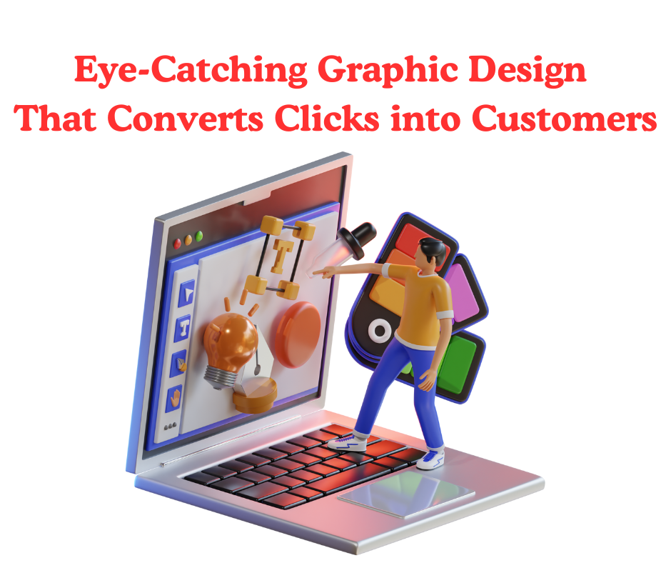
Eye-catching graphic design isn’t just about making things look good. It’s about grabbing attention and guiding people to take action. If you’re hoping to turn more web visitors into loyal customers or you’re designing marketing materials that need to spark a response, strong visual design is super important. I’m going to walk you through some practical ideas and approaches I’ve learned, so you can create visuals that do more than decorate; they actually convert.
Why Graphic Design Influences Conversions
Design has a way of speaking to people way before they ever read your message. In my experience, the right graphic elements, such as color combos, custom icons, thoughtful white space, and strong action buttons, can make the difference between someone skimming past your site or sticking around to buy. Research from Adobe shows that users form an opinion about a website in just 50 milliseconds, mostly from visual cues. That’s barely any time at all, so you really only have a narrow window to convince them to trust you or try your offer.
This matters for more than websites. Social media ads, business cards, flyers, and even email banners all fall into this quick-judgment zone. Clean design with a clear path for the eye helps visitors feel at ease. Cluttered, confusing layouts send people away fast.
Principles of Eye-Catching Graphic Design
Good design isn’t a happy accident. There are a few design basics I always keep in mind, and they’re really useful no matter what you’re working on:
- Contrast: Strong light and dark or color contrast draws attention and helps important content pop out quickly.
- Alignment: Everything should line up visually. Misaligned elements make a page feel amateur and scattered.
- Hierarchy: People read from big to small and left to right (in most languages). Your headlines, imagery, and buttons should follow that natural flow.
- Consistency: Repeated fonts, colors, and shapes create trust and make your brand feel professional.
- Whitespace: Having breathing room around content makes a design feel modern and allows the main message to stand out.
Common Mistakes (and How to Avoid Them)
Most people run into the same roadblocks in graphic design. I’ve made plenty of these errors myself, so here’s how to spot and dodge them:
- Too Many Fonts: Stick to one or two fonts. More than that starts to look messy and can distract from your message.
- Color Overload: Wild color palettes can pull attention away from what matters. Limit yourself to two or three main brand colors and one accent if you want your designs to look polished.
- Ignoring Image Quality: Fuzzy or pixelated images hurt trust. Always use high-resolution graphics or clear illustrations, and check their sharpness at actual size.
- Unclear Message: If someone can’t tell what you offer or what to do in three seconds, you need to edit. Use bold headlines and a single call to action to solve this.
- Skipping Brand Consistency: Switching up your logo, fonts, or colors in each piece of marketing makes you look less legit. Keep materials uniform to help customers recognize your brand instantly.
Other mistakes include forgetting to leave enough white space (which makes designs feel crowded), or using trendy effects—like too many drop shadows or gradients—just because you saw it elsewhere. Think about what helps your message shine, not just what looks cool in the moment.
Designing for Different Formats
Whether you need a business card that gets remembered or an Instagram ad that racks up clicks, the key is adapting your designs to each platform. Here are a few real-world tips I use:
- Business Cards: Keep details crisp—name, contact info, logo. Use color and texture to show your brand personality. If you’re ordering prints, check previews to make sure info isn’t too close to the edges; always double-check with a sample, since print colors can come out different than what you see on screen.
- Social Media Posts: Square or vertical posts grab more space in feeds. Bright colors and bold images stop the scroll. Focus on one key message per graphic, and don’t cram in tiny text no one can read on a phone.
- Flyers and Posters: Use one big image or main headline. If you’re sending the print to people’s homes (like a postcard campaign in Ireland), make sure contact info and offers stand out even at a distance. Test a few sizes to see what works best for your goals.
Stepping Up Your Design Game
Once you’re comfortable with the basics, you can start to get creative and level up your results. Here are a few ways I boost engagement and conversion in my projects:
Use Subtle Animation: On digital ads or sites, a moving button or glowing edge can catch eyes. But don’t let the effect overshadow your main message. Simple animations—like a soft fade or a pulsing outline—often do the trick.
Personalized Elements: Custom illustrations, special photo filters, or unique icons related to your product can set your brand apart from the competition. Originality makes your design feel more honest and memorable.
Testing and Tweaking: Run A/B tests with changes in button color, layout, or hero images. Sometimes, tweaking the smallest thing leads to way better results. Ask for honest feedback from real users, not just friends, and listen to what actually works for your customers.
If you want more engagement, connect with your audience through seasonal graphics, playful messages, or by updating your visuals for a big event. Freshness keeps people coming back and talking about your brand.
Frequently Asked Questions
Here are some common questions I hear from business owners and new designers trying to jumpstart their marketing with visuals:
How important is a logo for converting customers?
Your logo helps people remember your business. But if you want actual conversions, you’ll want to focus on clear calls to action and info people can read fast. The logo sets tone and trust, but it’s only one part of the marketing formula.
Should every page or ad have a different design?
If you give every piece a whole new look, people might get confused. Instead, adapt your graphics to each channel (like email, print, or ads) but stick with a consistent vibe: use the same fonts, base colors, and logos. Familiar branding helps people know it’s you, no matter where they see your ad.
Wrapping Up: Making Your Design Work Harder
Graphic design that converts isn’t about stuffing pages with color and shapes. It’s about making it simple for someone to spot, understand, and act on your offer. Eye-catching visuals paired with smart layout, clear calls to action, and a dash of creativity can nudge people from window shopping to actually buying or reaching out. Careful research and adjustments based on real feedback will help your designs get better over time.
If you need your new design ideas brought to life, whether on screen or on paper, team up with a print and delivery service you trust. In Ireland, for example, we deliver business cards right to your door, saving you time and helping you get your message out quickly. When your designs look great and are delivered reliably, you can focus on growing your reach and building more loyal customers.