
5 min read
Most advice on fixing inconsistent social media branding lists tips like picking better fonts, using brighter photos, and adding your logo. The tips work, but only in a sequence. If you build templates before you have chosen colors, you rebuild them when the colors change. If you choose fonts before you know what looks wrong, you fix the wrong things. The four steps below go in the order that avoids redoing work.
Step 1: Audit what a stranger sees
Open your profile in a logged-out browser window, or hand your phone to someone who has never seen your business and ask them to scroll. Look at your most recent nine posts as one block, because that is how a new visitor first takes in your feed.
Write down your answers to these questions:
- How many different background styles appear in those nine posts (photos, solid colors, textured images, screenshots)?
- How many colors are used for text and graphics?
- How many fonts appear?
- Can you read the text on every post on a phone held at arm’s length?
- Can a stranger tell what you sell or do within a few seconds?
- Is your logo in the same place on every post, or missing from some?
- Do your profile photo, name, and bio match on every platform you use?
Then mark the three posts you like best. They show what your feed already does well, and the next step builds on them.
Step 2: Lock one color palette and two fonts
A usable palette is small. Choose one main color, one or two supporting colors, one dark color for text, and one light color for backgrounds. Start from your logo or from the posts you marked in the audit, so you are not starting from nothing.

Save the exact color codes (the six-character hex values) in a note, since eyeballing a color each time is how slightly different blues end up in your feed.
For fonts, choose one for headlines and one for body text. Two is enough to create a hierarchy, and a third is usually where a feed starts to look mismatched. Pick fonts that stay readable at small sizes, and avoid decorative scripts for anything longer than a few words.
Check contrast before you commit. Dark text on a light background, or the reverse, reads well on a phone. Mid-tone text on a mid-tone background is a common reason posts are hard to read.
Write your rules down in one place: the colors, the two fonts, and which one is used for what.

Step 3: Give every post one clear message
Before you design a post, finish this sentence: “After seeing this, the viewer should know or do ___.” If you need the word “and” to finish it, you have two posts.
One message usually means:
- One headline in your headline font.
- At most one supporting line in your body font.
- One action, such as visiting the link, booking, saving, or replying.
Cutting text is the fastest way to improve a crowded post. If a graphic holds a paragraph, move most of the paragraph into the caption and keep the one sentence that stops a person from scrolling. Larger text with fewer words also solves the readability problem you found in the audit.
Photos follow the same rule. A product photo with a busy background carries two messages, the product and the clutter, so crop or reshoot until the product is the obvious subject.
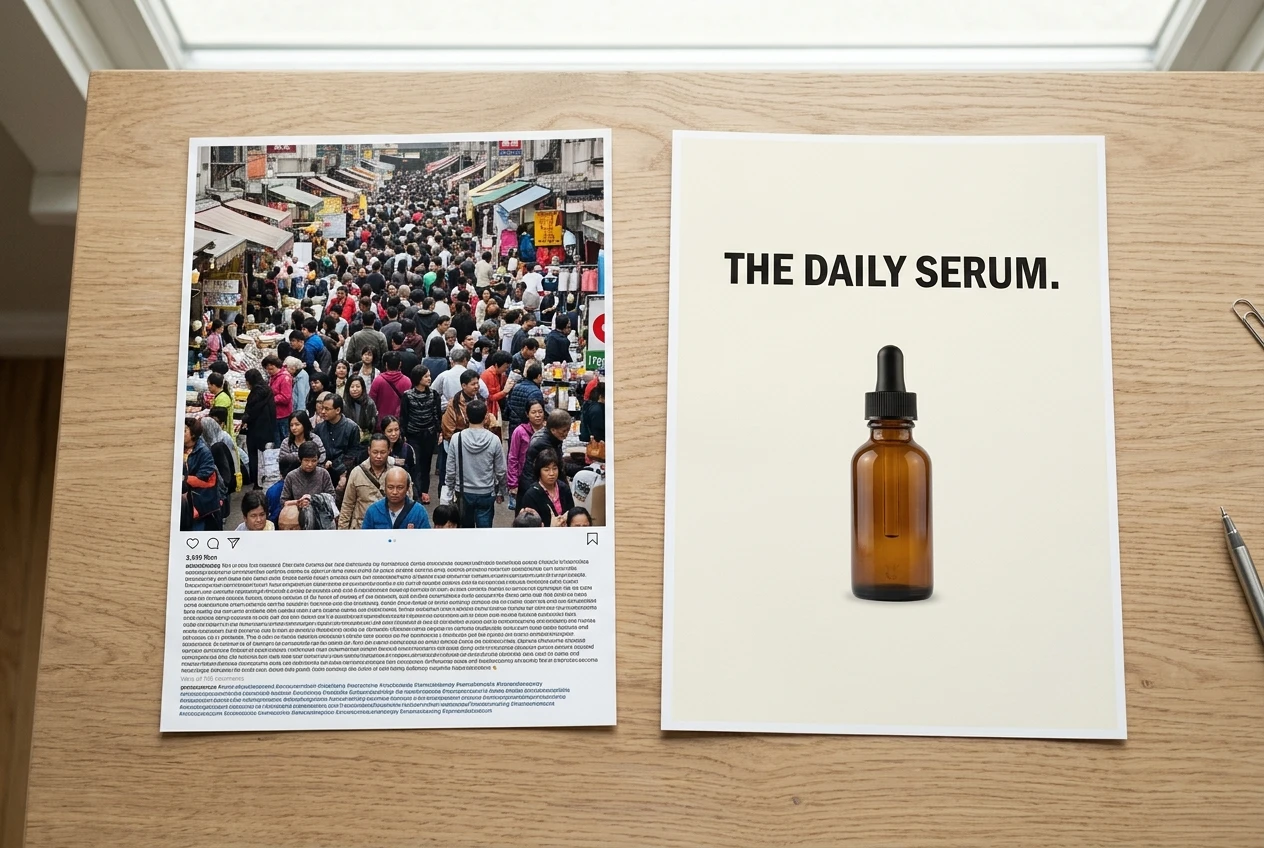
Step 4: Build repeatable templates
Templates come last because they store the decisions from steps 2 and 3. Once the palette, fonts, and message limit are fixed, a template makes them automatic.
List the kinds of posts you publish regularly. For many small businesses, that list includes:
- Announcements or promotions
- Tips or how-to posts
- Customer testimonials
- Product or service photos
- Short quotes or reminders
Make one template for each type in whatever design tool you already use. Each template should lock the background, font choices and sizes, logo position, and margins. Leave only two things changeable: the words and the image.
Name the templates clearly and keep them together. When you sit down to post, you duplicate a template, swap the text and image, and check it against your palette note. A week of posts then takes far less design thinking than it did before.

Keeping the feed consistent afterward
Run the step 1 checklist again after your first few weeks of new posts, then at a regular interval you can keep, such as once a month. Compare the answers with your first audit. If the count of colors or fonts has crept up, find the post that introduced the change and decide whether it belongs in the palette or should be redone from a template.
Not all old posts need replacing. The ones that clash most with the new look matter most, especially those in your top nine, so start there. Everything older will scroll out of view as new posts go up.
If a template stops working because your business changed, update the palette note first, then the templates, then the next posts. Keeping that order is what keeps your branding consistent.