5 min read
A graphic can be well composed, on brand, and nicely coloured, and still get no comments, clicks, or inquiries. That is the most common reason why social media graphics don’t get engagement. People judge them by whether they look good, and nobody asks what the viewer should do after seeing them.
A scrolling customer is not studying your post. They move past dozens of items and decide, almost instantly, whether this one is worth stopping for. A graphic that pleases you but gives them no reason to stop will be passed over, no matter how polished it is.
Designing for your taste instead of your customer
When you make your own graphics, you are the first and usually the only reviewer. You pick the colors you like, the font that suits your mood, the photo that looks best to you. Those choices are reasonable, but they answer the question “do I like this?” and your customer is asking “is this for me, and what do I get?”
A useful shift is to write down, before you open a design tool, who the post is for and what you want them to do afterward. If you cannot finish the sentence “After seeing this, I want them to ___”, the design has nothing to be built around.
The three-second test: what a scroller actually sees
Show your graphic to someone for three seconds, then hide it and ask them three questions:
- What did you see first?
- What was it offering or saying?
- What would you do next?
If the answers are vague, the graphic is doing decoration, not communication. Try it on your phone too. Most people see Facebook posts on a small screen, where fine print and thin fonts disappear. Shrink your design to thumbnail size on your desktop and check that the main point survives.
One post, one message, one next step
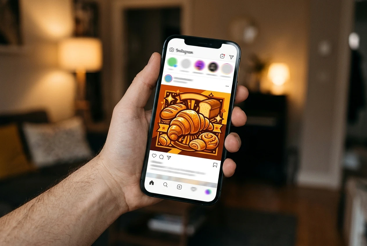
Graphics that try to carry an offer, an opening-hours update, a testimonial, and a logo give the eye nowhere to land. Pick the one message that matters for this post and remove whatever competes with it.
Then give the viewer one next step: comment with an answer to a question, tap a link, send a message, or book. Put that step in the caption and, where it fits, in the graphic itself. Two or three different requests in one post split the response, and most people will take none of them.
When text, fonts, and colors get in the way of the point
Design choices affect whether the message is read at all.
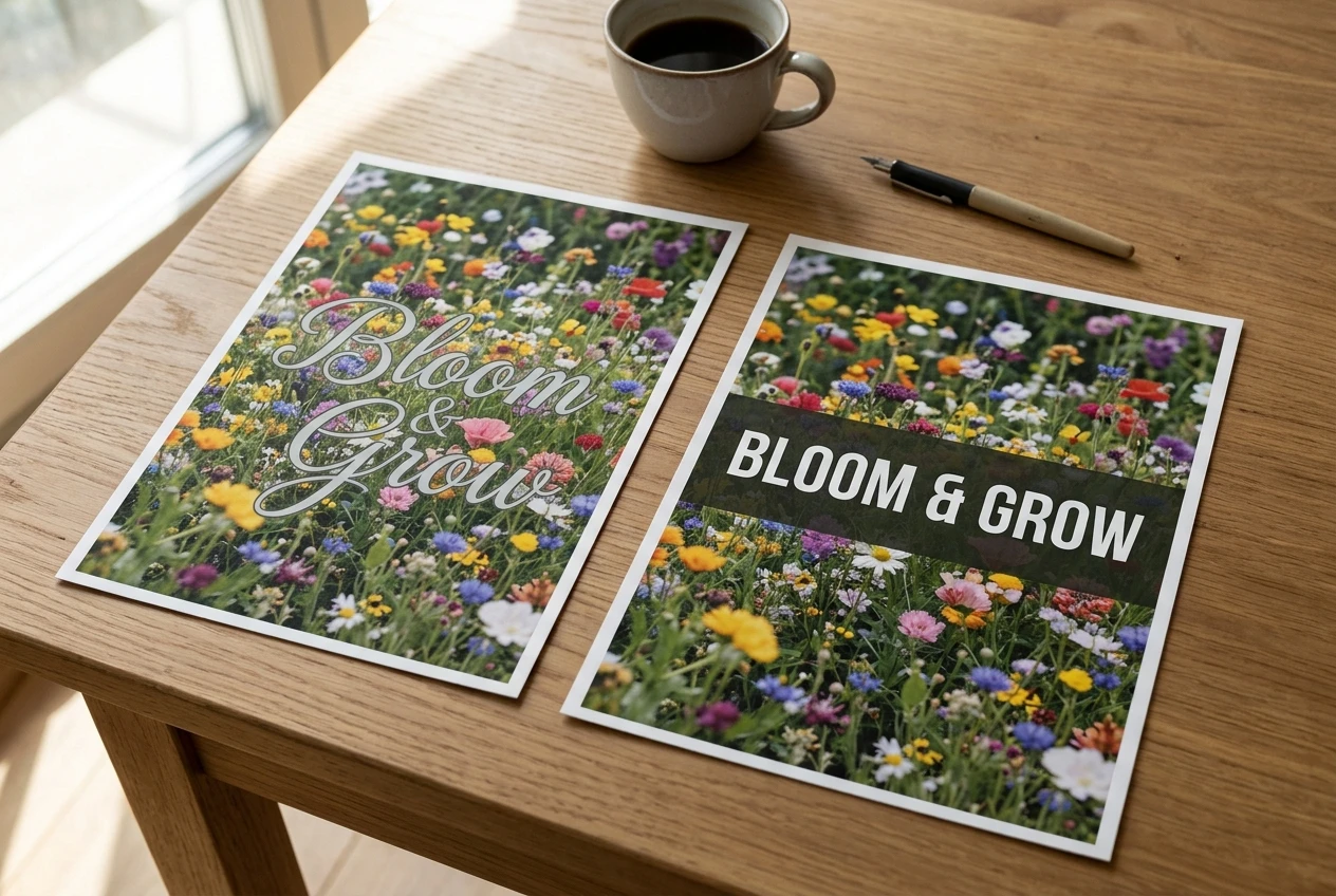
- Text size: Words that look elegant at full size can be unreadable on a phone. The headline should be the largest element.
- Fonts: Decorative scripts are hard to read quickly. Use a plain, legible font for the part that carries the message, and save any stylized font for a small accent.
- Contrast: Light grey on white, or text laid over a busy photo, makes the viewer work to read it. Strong contrast between text and background is the simplest fix.
- Amount of text: If the graphic needs a paragraph, the paragraph belongs in the caption. The image should carry a short headline.
Looking like everyone else: why generic templates blend in
Templates are a fast way to produce something tidy, but thousands of businesses use the same layouts, and your audience has seen them. A post that looks like a standard template tells the viewer it is standard content, which is easy to ignore.

You do not need to abandon templates. Make the post yours: use a real photo of your product, your premises, or your work instead of stock imagery, add a specific detail to the headline, and keep a consistent color and layout so regular followers recognize your posts before they read them. Specific beats generic, because specifics tell the viewer the post is about something real.
How to read your Facebook results and tell which designs work
Facebook’s Insights, or Meta Business Suite, shows how each post performed. Look at the numbers that match the action you wanted, not just the total.
- If the post was meant to start a conversation, compare comments and shares.
- If it was meant to send people to your website, compare link clicks.
- If it was meant to bring inquiries, count the messages and calls that followed.
Reach alone tells you how many people were shown the post, not whether the design worked. A post with modest reach and several inquiries beats one with high reach and none. Compare posts against your own earlier posts, and change one thing at a time (the headline, the photo, the call to action) so you can see what made the difference.
A quick audit to run on your last five posts
Open your last five graphics and score each one with yes or no answers:
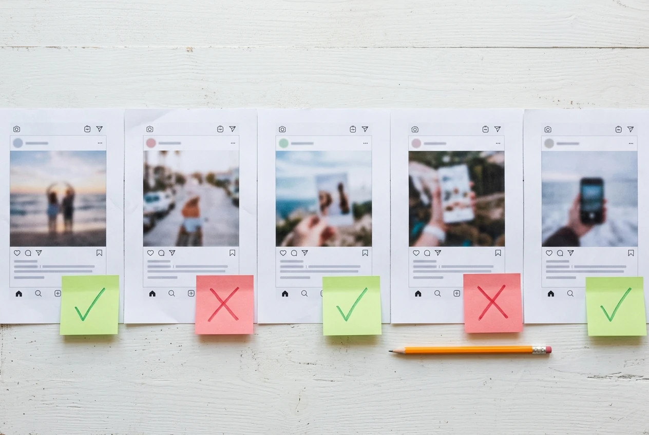
- Can I tell what it is about within three seconds on a phone screen?
- Is there one clear message?
- Is there one clear next step, stated in the graphic or caption?
- Is the headline readable at thumbnail size?
- Does it contain something specific to my business that a competitor’s post could not?
- Did the result in Insights match the action I wanted?
Any post with three or more “no” answers has an obvious thing to fix. Note which questions you fail most often, since that is usually a habit and not a one-off. If several posts have unreadable text, that is where to start.
Then redesign the weakest one with a single change, post it, and compare it with the original. Repeating this over a few weeks shows you what your own customers respond to, which is better evidence than anyone’s opinion of how the graphics look, including yours.