5 min read
If you are asking why my Facebook posts don’t get sales even though the graphics look clean, the cause usually isn’t the look. A graphic can be tidy, on brand, and well liked, and still give a buyer no reason to act. This article works as a self-check built on the six themes of the Conversion-Focused Content Pillars series. Each section gives one diagnostic, so you can name where your posts lose the sale and decide whether to keep designing them yourself.
Your visuals are talking, but nobody’s listening
Look at your last five graphics and ask what each one told a stranger to do. If the answer is “nothing in particular,” the post was decoration. Likes and friendly comments can hide this, because they show people approved of the image and say nothing about whether anyone wanted the offer.
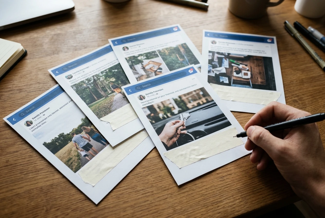
The diagnostic: cover the caption and read only the graphic. Can you tell what is being offered, who it is for, and what happens next? If not, the graphic is not carrying the message. This series post goes deeper into how visuals and message work together.
What DIY design costs you every month in sales
Designing your own graphics feels free, but it costs your time, and it costs the sales that weaker posts fail to bring in. Time spent in a design app is time not spent serving customers or following up with leads.
The diagnostic: estimate how many hours you spend on graphics each month, then ask what you would do with those hours otherwise. Compare that with what one extra customer is worth to you. If the hours would earn more elsewhere, the do-it-yourself approach is costing you money. The full series post covers this cost in more detail.
What your feed says about your brand authority before anyone reads a word
People judge a Page in seconds, before they read any caption. A feed with mismatched fonts, shifting colors, and uneven layouts suggests a business that is hard to rely on, no matter how good the work behind it.

The diagnostic: scroll your Page as a first-time visitor would and look at the last twelve posts together. Do they look like they come from one business? Would you trust that business with your money? Consistency tells a buyer you are established, and the series post on authority explains what to standardize.
Design patterns that quietly block the sale
Some habits make a graphic harder to act on. Common ones include too much text, several competing messages in one image, low contrast that makes words hard to read on a phone, and no clear point for the eye to land on.

The diagnostic: view your graphic at the size it appears on a phone screen, from arm’s length. If you have to squint, or your eye jumps between three things, a buyer scrolling quickly will pass it by. The series post on design patterns describes these blockers in full and shows what to change.
Turning your Facebook Page into a lead generation tool
A Page that only shows off your work leaves visitors with nothing to do. A Page that generates leads gives them a path: a clear offer in the posts, a matching button, and a next step that is easy to find.

The diagnostic: pick a post that performed well and trace what an interested viewer would do next. Can they reach a message, a form, a booking page or a product in a click or two? If the route is unclear, interest ends at the post. The lead-generation series covers how to connect graphics to that route.
Three questions to ask before you post your next graphic
A short check before publishing catches most of the problems above. Ask these three:
- What is the one action I want from this post? If you list two or three, choose one.
- Could a stranger understand the offer from the image alone? If the caption has to explain everything, revise the image.
- Does it look like it belongs with my last ten posts? If not, fix the colors, fonts, or layout before it goes live.
Use these questions on every graphic for two weeks. If you keep failing the same one, you have found your weak point, and the matching series post is the place to start.
How to tell it’s time to stop doing this alone
Doing it yourself is reasonable while it works. It stops working when one or more of these is true:
- You fail the same diagnostic repeatedly and do not know how to fix it.
- Graphics take hours you cannot spare, so posting becomes irregular.
- Your feed looks different week to week because you make each graphic from scratch.
- Your posts get attention but few messages, inquiries, or sales.
Any one of these is a reason to hand social media design to a professional. Together, they suggest the do-it-yourself approach is probably holding the business back. Handing it off does not mean giving up control of your message. You still decide what you sell and to whom, and a designer turns that into graphics built to get a response.
Need a hand with your social media graphics or branding? Feel free to reach out to me at Swags Graphic Designs. I’d be happy to chat about your ideas, answer questions, and see how I can help your business stand out.